Even a few years back, people were skeptical of purchasing things online. Today, we cannot imagine our lives without online shopping. And because our seller is probably staying in another part of the world, pictures are as close as we can come to having a good look at the product.
Product photography is one of the most integral parts of any eCommerce store. After years of its existence (online shopping), we have learned a few things that work in product photography and what results in bad product photography. In this blog, we will discuss 7 examples of bad product photography and how to avoid these common photography mistakes for your website.
7 common product photography mistakes to avoid
Let’s discuss the 7 most common mistakes that people make in product photography :
1. Lack of proper lighting
Let’s begin with lighting. The kind of lighting you will use is the first thing to decide. This is because if your lighting isn’t proper, then the editing phase of the photograph is going to be challenging.
A lack of proper lighting results in the image looking dull. On the other hand, mixing light sources, such as white light plus yellow light, are examples of bad product photography.
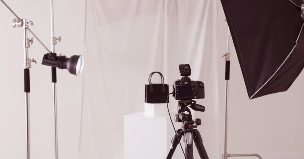
Here is what you can do to avoid poor photography - Invest in a lightbox. They are budget-friendly and the best if you are shooting at a small scale. Professional studio photoshoots, however, work best for bigger products.
You can take pictures from your smartphone using natural lighting. However, investing in professional studio photography for an eCommerce website will be your best bet.
Use manual editing and white balance to make the product in the picture similar to what your eyes see. You can manually adjust the white balance according to your light source. Setting up the white balance will make editing and retouching the image easier. At the very least, you can set it to auto white balance. Finally, convert your pictures to SRGB to ensure your image color is accurate across different devices.
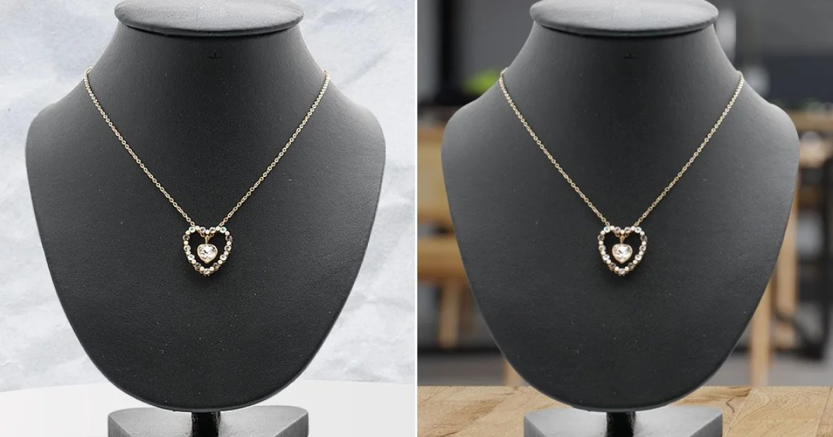
On the other hand, black product photography is different from colorful product photography. If you are shooting for dark food or jewelry then dark product photography requires minimum lighting.
2. Random reflections and shadows
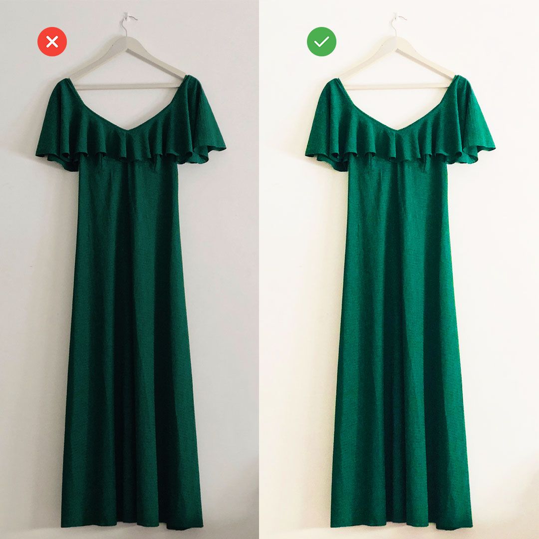
We have got lighting out of our way. It is time to focus on shadows. One of the main reasons random reflections and shadows appear in the first place is because of having too many light sources.
Product photography on black background doesn’t cause much of a hassle here. However, to take cool white product photos, you can avoid shadows by having just one light source. For example, if you use artificial white light, use only artificial white light for your subject’s front, back, and side. Also, don’t keep any random object in front of your light source other than your subject.
3. Cluttered or busy backgrounds
Having too many things in your photo can take the attention toward the unnecessary clutter. It can confuse your audience. Humans have a short attention span. Having a distracting background won’t only cost you your customer’s attention but valuable sales. You want to attract your audience’s attention to your product at first glance. And keeping the background clean and simple is critical.
You can avoid a cluttered background by simply positioning your subject in front of a vinyl or white background. Use proper lighting like how we discussed in point number one above. Artificial lighting will give the product a better effect. If you are shooting a small product, you can invest in a lightbox. A product photography green screen can be used if you want to later edit your image background.

4. Out of focus/blurry photographs
The primary causes of unfocused, blurry photographs are -
- Not pre-focusing the camera on the main features of the product beforehand
- Unsteady camera
To avoid poor photography, you can use a tripod and set shutter delay. Set your camera focus on the elements of your product you want to focus on.
Instead of holding the camera, you can use a tripod to avoid a shaky picture. Set your camera on manual mode. In this way, you can adjust what aspects of your product you want to focus on. Using manual mode (M) will help you take full advantage of what your camera offers.
You can increase the aperture to F/2.8, F/5.6, or F/11. This will focus on the details of your image. Test your lens to determine the ideal F-stop for your product image. You can test between F/5.6 and F/16 and see what works for you.

5. Getting too creative with angles or product positioning
As an eCommerce business, you constantly market to your cold and warm audiences. This group of people either came across you for the first time or know you but are skeptical about buying from you.
The best way to make this audience convert is by being transparent, showcase your product from all different angles, and displaying the product features. This helps build trust.
Your product image is the closest your customer will get to know about your product on a screen. When you take pictures of your product from different angles, your audience knows what it will look like when they purchase it.
So whether you are creating product images for eBay or for your own website, make sure you take pictures from different angles for better conversion.
Take pictures from different angles. Take close-ups if it’s relevant, shots from a distance, front and back. Take photos from various angles. You can always discard the extras later.
Also, make sure that the camera’s distance from your subject is the same across all pictures to avoid inconsistency in the images. You can use the DoMyShoot app to ensure your product is positioned well while shooting.
6. Ignoring the product’s most important features
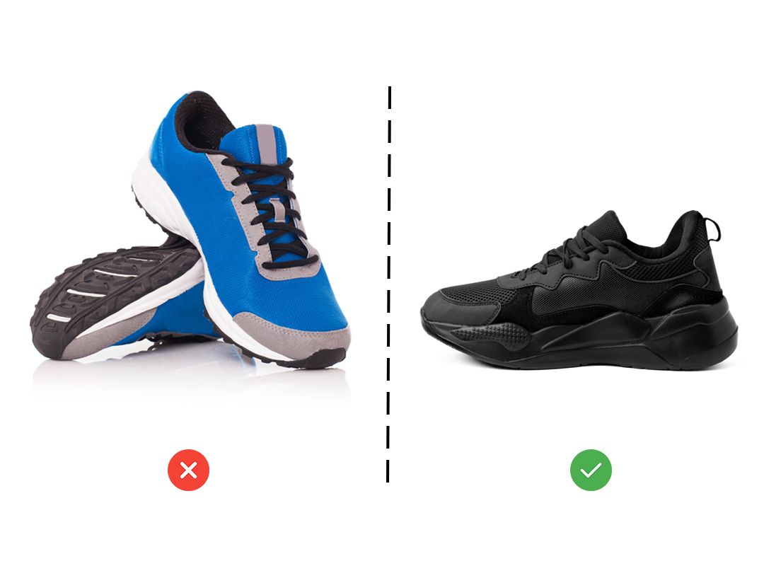
Your product’s features are things about your product that make it stand out from the other similar products in the market. Does your product have a different design? Does it have an element that other similar products don’t?
When you see why your product stands out and what it offers to the audience, it’ll become easier for you to capture this on camera. This, in turn, will help your potential customers see it. Take some time, study your product and highlight these features in your photoshoot.
You can highlight your product’s features by zooming in and focusing on them. Play with the lighting to make its features stand out.
7. Not clicking enough photos and enough angles
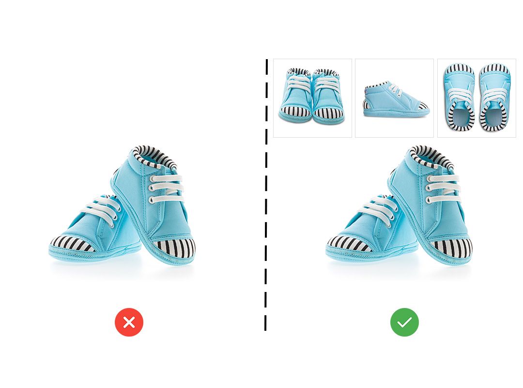
In the eCommerce world, your product images do your selling for you. And the more images there are of your product, the more will your audience be able to trust you. Take your product’s pictures from different angles. Focus on the features of your product. As a customer of your product, what things would you like to know about your product? The color, the texture, and the quality of the fabric are some of the features that can influence your buyer’s decisions.
Keep your camera attached to a tripod and place your subject in different positions. This is to make sure the focal length for all the images is the same for your shots to look consistent.
Depending on the type of your product, the importance of the number of pictures will vary. Premium-priced products will require more shots. If you are selling a handmade product, take a couple of close-up shots. About 3 to 5 photos will work just fine.
An easier way to get high-quality product photos
We discussed the 7 common photography mistakes most make that lead to a bad product photoshoot. There is a simpler method to do that with Dresma.
Our mobile app for product photography, DoMyShoot helps you take pro-quality photos for product listings and social media posts in . You can drive more sales on Amazon, eBay, Etsy, Facebook, and Instagram with the DoMyShoot app by Dresma.


